
What my research needs to revolve around is contemporary character designs and animations, how both have been done and what they bring to the story. While contemporary means recent and trendy character designs, Dave thinks it will be more helpful to consider the animations that are less well known. Obviously, even though they are more obscure and less known, I suppose Dave means contemporary in the way that most animators have adapted to such a style.
Well, when considering such work, I always turn to the many animations that I saw when I was in Berlin at Pictoplasma (man, I so hope I can go again this year...). A few days ago, we had a small recap on a couple of animations that used simplistic or contemporary character designs that the animator found smiple to animate or people would relate their design to something similar. I think it's best to start there.
BIRDBOY- Pedro Rivero and Alberto Vazquez
I didn't catch much of this animation, was late to the festival for some reason I can't remember. But what I did see, I really liked. The piece itself is subtitled but the emotion was still there. The animation was about the stigma that Birdboy seems to suffer and the little mouse girl that is there for him. I wasn't able to find the full animation anywhere sadly but this trailer is nice enough to show.
Apparently the animation started cheerful and bright until the mouse family caused an explosion that created the dark world shown in the animation. Birdboy is one of the few survivors of said explosion and often suffers stigma due to rumours spread about him.
I like the way the backgrounds and characters are coloured. They look almost like illustrations one might find in a childrens book yet at the same time, there is an eerie, twisted and somewhat depressing tone to it, which defies the conventions used for such a style. That alone interests me.

WISDOM TEETH- Don Hertzfeldt
Now this animation I remember quite vividly. What I think got everyone the most was that there were basically stick figures yet you would still cringe at the sound of the stitches being pulled out for something along the lines of two and a half minutes straight and at the marker drawn blood doing down the figures body, You don't even know these character's names and yet you just can't help but relate to them... kind of.
The animation seems to be done traditionally, using just markers. At least until the hallucination scenes when the stick guy has the baby in his mouth.

GIANT- Celine and Yann
I never caught these at Pictoplasma but managed to finally see them a few days ago. I really enjoyed the design of the characters and I loved how the animators brought things like the sun, clouds and moon to life in their work and had them convey emotion and wonder (the cloud crying rain, the moon bringing back the balloon and the sun making the city wake up and make noise when it comes out of its hiding place). All of the animations end in a somewhat humorous and destructive way. I particularly liked the one of the sun, especially when it tries to rebuild the city it had a help in destroying.

GLUKO AND LENNON- Punga
Gluko & Lennon ENG from Gluko & Lennon on Vimeo.

Doomed - English Trailer from El Señor Studio on Vimeo.

I've definitely mentioned this one on my blog before, comparing the two main characters to Spongebob and Patrick. Lets be honest, but those two pairs in a room, it would be F.U.N at first sight. But I digress. I loved this animation. The bright colours, general happiness and the fun of everything really raised a smile from everyone in the room. I could use a smile right now so I'll probably end up watching this once I've finished the blog entry...
Oh and the characters, while looking 2D, were actually done in a 3D way. As I'm avoiding 3D like the plague, this probably isn't the route I would take for my own work. However, this style is very contemporary and enjoyable to watch.
DOOMED- Guillermo Garcia Carsi
Doomed - English Trailer from El Señor Studio on Vimeo.
Sadly I wasn't able to find the full animation so this trailer will have to do. I'll hunt for it and link it if I ever find it.
This will definitely be a big inspiration to me in terms of how narration has been used in animation. In this instance, it is used because these characters don't exist in real life and so the absurdity of these character designs (especially the hedgehogs with the inward spikes) add to the humour, especially when they seem to defy logic and go against their will for life. Hence, Doomed.
To justify my own decision to narrate my animation, it is mainly something of a spoof of documentaries like Meerkat Manor (the title I am considering is also a parody- Pigeon Planet) how pigeons can be relatively mundane and seen in everyday life, often as a nuisance. I don't think I've seen a pigeon documentary done before. If I find one, I'll study it and link it to the blog. Its basically mainly to give a documentary about pigeons a, most likely undeserved, sense of elegance and prestige that one would get from the meerkat documentary.
The humour of the c=documentary is my main source of reference here, as I will not be using unusual characters or working in 3D. I do however find the designs enjoyable.
Also, I met the animator in Berlin and he drew me a cubefish. I was so happy... I'll put a pic up later.
THE UNDERWEAR RULE- Punga
Made by those geniuses who did Gluko and Lennon, they were commissioned by the Council of Europe to create an animation about teaching kids not to fall victim to sexual abuse. Considering the subject matter, it is handled in a very light matter, portraying the child as a cute green thing wearing underpants and the pervy adult is represented by the hand. I like how they handled this subject in a way that will get the childs attention and have them listen and adapt the rule to their life and keep them safe.
Again, it has been done in 3D but the simplistic design and indeed the representation of the hand are quite clever. It shows that we don't have to always use a detailed human being to get the point across.

ON MELONCHOLY HILL- Jamie Hewlett and Pete Candeland
Sung by Gorillaz
This animation I was surprised yet delighted to see. One of my favourite songs and an amazing music video to boot. Wonderful! They seem to combine characters that look traditional to a 3D landscape, which to me would be really difficult to pull off. I find it really wonderful to look at though and I have always really admired how the character designers and animators bring the musicians to life through animation.

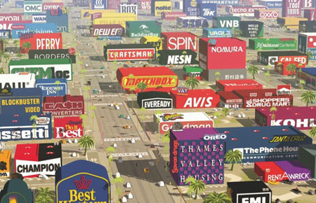
LOGORAMA- Ludovic Houplain, Francois Alaux, Herve de Crecy
This one was just such a scream. I thought it was amazing how they took pretty much every logo and mascot in existence (more or less) and applied them into buildings, bikes, cars, characters and at the end planets. It especially tickled me that not only was Ronald McDonald the bad guy but what tripped him over was the huge weightwatchers sign being the cause of Ronald falling into the crack in the road. I smell ironyyyyy!
I don't think I would apply any techniques of this to my work as again it looks 3D which isn't what I want to achieve for my project. However, I had to link this here because... come on. Soooo many puns and so much irony.
I couldn't decide what picture to use for this one so... here's a lot of them.
I couldn't decide what picture to use for this one so... here's a lot of them.


DADDY'S LITTLE DOLL- Paulo Muppet and Luciana Eguti
I just found this absolutely adorable. However I will admit, this doesn't relate to the project I am doing currently. When I draw, I often try to draw in such old time speghetti limbs. I just find something so fluid and enchanting to them. Its something of a reference to my usual work I suppose.

BEAR UNTITLED- Christen Bach
OK, this one I'm not using as a reference to character design, I've just been looking for it for months and finally found it after seeing it at Pictoplasma. it's just so... absurd. A relationship between a hunter and a bear. That can only raise many many questions.
I liked the 8 bit graphic animation style, I have a fondness for such graphics. And the voices sound like they've used Microsoft Sam or whatever they're calling him these days.

MEERKOVO- Darren Walsh
Compare the Market/Meerkat
... yeah, I'm not using this as reference in any way. I just absolutely adore these meerkats. They're realistic looking (despite the whole clothes wearing thing) and just adorable overall. Like my pigeons! It relates! Simples!

I do have more that I want to share but I think I should probably save them for another blog, otherwise I'll have nothing to write about for another blog entry. I can blather on sometimes.
Next research blog, I'll reference a couple more animations I saw AND mention some more mainstream things that I find inspirational as well. So yeah, look forward to that.
Pip pip, cheerio!
No comments:
Post a Comment
Got any advice? Any opinions or ideas that you want to share? Just think I'm a straight up idiot? Feel free to let me know and I'll reply in kind <3