Tuesday 30 August 2011

Pigeon Progress: OMG a storyboard!

Yep, finally have one of them done to show you!


There's no text added just yet so the actions may not be all that clear. Basically, Blue is flying through the air minding her own business when a fat green blur bashes into her and sends her flying (so to speak). She squawks at him in outrage and he apologises hurriedly before rushing off. Blue follows him, either to find out where he's going or to give the green tosser a piece of her mind.

Only time will tell... *wiggles fingers*

Well, I'll be back in the UK officially on thursday. It's been a fun three months with Brandon but family, college and immigration call. Hopefully we'll be able to see each other sooner than a year this time. For now, I'm just gonna spend my last day here enjoying myself before a long grueling day of connections and flights. Bleh.

Here's something funny so I don't cry or something.


Did I ever mention that I love Rango? Cos I do, that movie is friggin epic.

Heheh... animating is serious business, yo.

Thursday 25 August 2011

Love and Tolerance


... yep, thats what did it.

 I'm experimenting with the lineart and colouring style and so far I'm having fun with it. Might even draw more than my Doodle Bug pony one of these days. I have drawn other characters.

But they haven't been coloured yet, so stuff that. Here's Doodle. Again.


Gotta admit, I like her cutie mark. Sadly she's not as cool as Rainbow Dash or Pinkie Pie. But that's only to be expected.

I Don't Even


Or the sensible. I forget which.


Just a little practice with my new colouring lineart style when I should have been sleeping. Again.

I did a picture like this earlier this year and decided to try again to see how my style has changed. Feel free to look at my dA gallery to see how different they are: http://tehemmaturedoodlebug.deviantart.com/gallery/#/d38vwje

Dear God, why did I like that picture so long ago? Were my eyes even working? Oy...

Yeah, I changed the title picture as well. Methinks I will do that occasionally. Doesn't take too long to do so why the hell not

... oh yeah storyboards. YES I AM... uh... working on that. Indeed. Just... not right this minute. I would but I'm tired and I need a storyboard template still. Gonna ask around for that.

For now, I'm just gonna make like a bunny and sleep.


Pigeon Progress: Doodles

Nothing particularly groundbreaking so far, just did a couple of pics with Lilac and Blue. It was mainly to practice drawing pigeons and also a little play around with backgrounds. I'm thinking of making them more realistic and less cartoony in contrast to the characters. Not too sure, gonna think more about that.

References were used. And don't worry, still workin' on them storyboards!


Sunday 21 August 2011

Pigeon Progress: An Explosion of Pigeon Shit

... when I say shit, I mean stuff. Obviously. *snerk*

But yes, lo and behold, I have finally finished all the character sheets!


*couchapartfromthecolournamescoughneedhelprememberinghowtodothatcough*

As you can see, I changed Blue and Lilac's sheets slightly. Namely changing the font on Blue's sheet and of course adding the thick inner lines. I'm also a complete dumbass, it wasn't film grain I used for Lilac's body. It's uhh... bugger, what was that filter called?

... damn. Guess I'll have to write it down when I remember.

I also decided to work on something half for fun and half for this project. A big part of the animation is Green and Lilac's intense dislike for each other and while I was on cheezburger, I found something that, odd as it is, inspired me.


The last panel makes me think of how Lilac and Green would be in a fight. I couldn't resist using it as a reference.


Just decided to add a WIP version so you can see a little bit of how it looks while being made. I'd just completed colouring lilac and hadn't added the filter yet, hence the lack of texture. I was just getting started on colouring Green's lineart.

Underneath, I have two finished versions. Lets play Spot The Difference!


Yeah, I guess I wanted to see how it would look with a bit of blood. Looks like Lilac has them talons pretty deep in there! I think it kind of works but eh... let me know if you have an opinion.

I should really sleep now. Or look at Art Student Owl again.

... yeah, I think I'll do that.


Saturday 20 August 2011

Pigeon Progress: Line Up

HA! Finally I buckled down and got the designs of  my pink and green pigeons done! To celebrate this momentous (or something) occassion, I've done a lineup of the four pigeons together.


As you can see, I decided to use the thick inner lines.

Line ups seem to be all I've done lately. Well, I still need to do Pink and Green's character sheets and then it's storyboardin' time!

2am in the USA


Eeyup.

Well, I've been experimenting with my work so at least it wasn't a waste. For a long time now I've adored the lineart and colouring used in My Little Pony: Friendship is Magic and so I decided to try drawing a few characters of mine in that style.

Here's a small line up of a few characters of mine. This isn't all of them but these are the ones I draw often.


Lotta animals here. I should draw humans more bloody often.

I think Ruby (second character) came out the best, personally. Funnily enough, she was the first one I did. The Cat was the last one and I think it sucks. Might possibly redo one of these days.

The lineart isn't too difficult for me to do. I mainly use the pen tool in Illustrator, save the file, open it in Photoshop, run the eraser along the lineart to create pointed ends (the calligraphic option in Illustrator is too thin to get the look I'm going for), lock the layer so that the colour will go on the lines and then profit! Sounds time consuming but it hasn't grudged me so far. Spare the back pain but I've grown to expect that.

Figured since I haven't put anything unrelated to pigeons/whatever I found online on here nowadays, I might as well share something I did in my spare time. Which is rather sparse these days. No wonder I sleep til tea time.

Now, if you'll excuse me...


Friday 19 August 2011

Pigeon Progress: Inner Lines Comparisons

Here's another comparison thingamajig with the pigeons.

I've ultimately decided to go with the textures because it does make the character stand out (not to mention everyone preferred textures to the plain design) but I'm a little worried that the lines within the pigeon characters won't be seen.

In this I have included how the pigeons look now and how they'd look with the thicker inner lines. I might go with thicker lines but I'm unsure if they're not a little TOO noticeable and will distract the viewer from whats happening in the animation. Again, I'll most likely wait til I hear some opinions and suggestions before making a final decision.

Feel free to share advice!


Inspiration

Just two things for me to have in my blog to look back on if I ever get that dreaded self doubt. Which happens more often than I'd like it to. I blame whatever I ate last night.

Which was Thai BBQ Chicken. That was some damn good chicken.

.. *ahem* well, anyway, we all have our off days where we feel we can't draw something just right or how we're not as good as someone else we admire. Such things can make someone feel like their work isn't worth anything. It's a crappy feeling and if you're anything like me, makes you feel next to worthless. For want of a less dramatic way to put it.

So when I discover something online that hits home or makes me feel better or gives me something to aspire to, I always itch to share it with someone in the hopes that they find it useful as well.

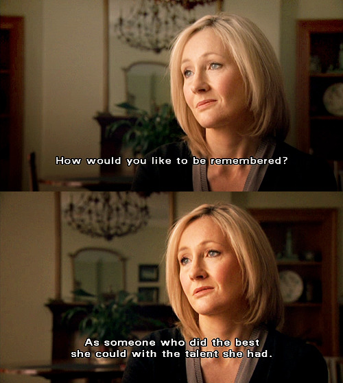
First is something from an interview with J.K Rowling, one of my favourite authors and also a very inspirational figure of mine. She's a humble woman who started writing her wonderful series in a coffee house with barely a pot to pee in. She went through many many rejections before someone finally recognised the genius of Harry Potter. That alone rises my spirits and gives me hope that if I keep on trying, no matter how often my own work gets rejected, I'll experience that same joy.


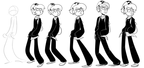
Another thing I found inspirational was a MLP comic from a dA user called Capt~Nemo, featuring my favourite character Rainbow Dash. Everytime I see something like this featuring her, it reminds me of my own dream and how I want to imagine looking back on my life and be happy with what I've achieved.

... I know, this has gotten ridiculously sappy. I look into crap way too much; it's a curse.

Anyhow, here's a link to the comic: http://capt-nemo.deviantart.com/art/Memories-253545420
On an artistic front, I also like the layout of the comic; it's incredibly creative how the different stages of Dash's life transitions into the next, especially near the end how it fades to greyscale when we reach her old age. Subtle things like that just amaze me to no end.
You'll also be able to look at their gallery as well. They've captured the style of the show perfectly, it's unbelievable.

Anyhow, I promise I'll upload something relating to work I've done! I intend to in my next entry which I'll put up after this. I just wanted to share something that made me feel so much better about my work and not to give up when it seems no one's interested in what I have to offer. After all, self doubt is the only thing that can truly end one's aspirations.

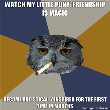
Right, I'm done being all preachy and whatnot now. Rainbow Dash says hi!

Picture taken from: http://nethear.deviantart.com/art/Rainbow-Dash-244004139

Wednesday 17 August 2011

The Amazing World of Gumball

OK LAST POST OF THE DAY, I PROMISE. Need to get some doodlin' done anyway.

BUT. I just had to mention this show.

I FREAKING LOVE GUMBALL


Its just so silly and zany and just what the everlasting hell.


I love, love LOVE the designs and the general style of the show. The backgrounds and settings are realistic yet the characters are 2D/3D/photo/puppets/whatever. Its just so damn creative.
And I love how they do the night sky with glowing star shaped stars. I don't know why that appeals to me so much, it just does. I love it.

Also the jokes in this show are just funny as eff. Seems like cartoons these days are FINALLY starting to pick up. I almost forgot you didn't have to swear to be funny.


And the character designs are just so random but creative. I mean look at this girl. She's an antlered peanut. Lulwhut? Who would eat that? Why would a cat be in love with that? And why do I not care? Cos she's awesome and adorable and just a sweetie pie, that's friggin why.


And oh man, this episode I LOVED. The robber... is a fingerprint. My God. THAT. Is GENIUS. I didn't even realise at first and when I did I was like HOLY... CRAP...


Seriously, that is amazing. Plus, with all the various styles and settings packed in the one show, it just reminds me so much of Pictoplasma. I'm not entirely sure why exactly, I just feel like I could have seen something like this in Berlin. And anything that reminds me of Pictoplasma makes me happy.

Man, ever since I came to the states and had Cartoon Network on 24/7 I've really seen a few cartoons that make me realise that there aren't only crappy shows on TV anymore. My Little Pony, Regular Show, Adventure Time, Gumball... just  wonderful stuff, and I enjoy the styles of all of them. Might experiment drawing in the same styles as all these shows.

Which reminds me, I still need to upload my Friendship is Magic stuff on here eventually. Mwahahaaa...

Push your Poses!

Something I've found when drawing cartoons is that you can get away with that little bit more; creating fluid movement despite the fact that the character in the picture is still. The secret to making the pose that little bit more dynamic lies in the Line of Action, shown here.


This is certainly helpful when showing movement in animation and/or cartoon style comics. Another thing I'd advise you look at is this here. It tells you to think of a simple pose and then find a way to make it that more fluid and therefore, that more impressive.


Hope this helps someone! I know they'll both certainly help me.

Don't Force Your Style

Being the swotty so and so that I am, I'm constantly looking for inspiration and helpful tips online or anywhere I can. If I find something, anything, that a fellow artist/cartoonist/whatever can relate to or find useful, I don't hesitate to put it on here in the hopes that it will help someone out. Here, I found something that I know will help me and hopefully help someone else stress a little over their work too.

I have my moments where I feel like I can't draw for crap or when I try to recreate something in my drawing style, I make it look too bad. but after finding this, I realise it's silly to worry so much over it. Style is something that happens naturally and can also change every time you draw something, even if it's subtle or obvious. I'm terrible for constantly fussing over how something looks and how it has to be just right. Hopefully now that I have this on my blog where I can click and look at it, I'll remember not to sweat the petty stuff... or pet the sweaty stuff.

Here is a link to the specific article, drawn and written by the artist herself: http://elixiroverdose.tumblr.com/post/8547986337/style-i-dont-think-a-style-needs-to-be-drawn-or

They also gave useful advice when you're not sure what to draw or how to work ones way around art block. Always helpful to know, methinks! http://elixiroverdose.tumblr.com/post/7292721589/so-with-every-artist-that-ive-ever-asked-for-drawing

I've been watching this artist on dA for a long time now and followed their tumblr recently. They have a very fun and imaginative style which I find inspiring and also nostalgic. I definitely recommend you check them out!

Tumblr: http://elixiroverdose.tumblr.com/
dA: http://elixirmy.deviantart.com/


Now, if you'll excuse me, I'm going to doodle something (most likely anything but pigeons... procrastination FTW), eat popcorn and figure out how to dye my hair rainbow. All in a days work.

Friday 12 August 2011

Pigeon Progress: Character Sheets and Texture Comparisons

Finally, something I can actually show you all!

These past few weeks I have been sketching pigeons every chance I get and as of today I have finally gotten around to creating their character sheets. So far I have only done two- one for the blue pigeon and one for a new character- a lilac king pigeon. I intend to get started on the other two tomorrow and possibly have them done by the end of the week so that I can focus on polishing off the storyboards.

However before I can really do that, I need to decide what I am going to do with the pigeons designs- do I give the feathers texture or not? You see, in the old version, my pigeon characters had the sponge filter on their feathers added from Photoshop to give the pigeons a papery appearance, as part of the module was to create a cut out design. I am still undecided whether or not I will do that with this newer version but I definitely intend to keep the simplistic yet realistic designs that I gave the pigeons last time.

Here are the comparisons. They aren't obvious at first glance I believe but if you click on the picture to make it bigger, you might be able to see the differences between the two.


And here are both of their character sheets. The textured version are on both of them but I have a copy with the untextured pigeon as well if I decide to go with that instead.


If anyone has any comments/questions/queries/issues, please feel free to share!