Thursday 22 November 2012

Crumbs: Proposal and Character Sheets

Yikes, I've kind of been slipping on the whole updating thing. Sorry about that. But I have news to share, all Crumbs related!

My presentation was today and I believe I was successful for the most part, covering the majority of what I intended to. I was questioned a bit on the whole income part and budget so I reckon I should look more into that. It's admittedly something I've overlooked for the most part as gaining profit isn't a priority with the comic. But everything else they seemed to be happy with.

My proposal has also been handed in a day early so I don't have to go in tomorrow. Saves money for train fare and I get to have a lie in. Getting up at 7am was killer after a long time of forgetting that time even existed. Anyway, I digress. I hope that the proposal is good enough to get a pass at the very least. Writing what I want to do and why I want to do it isn't a strength of mine (this blog should be proof of that) and it makes me nervous to think that the dissertation still needs to be done.

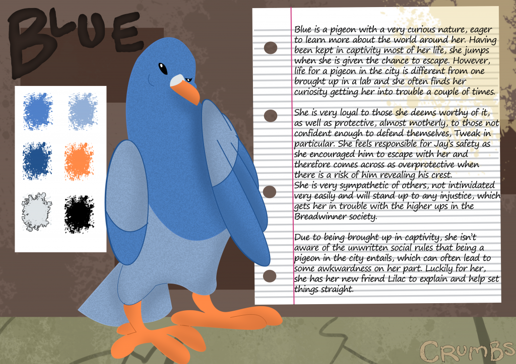
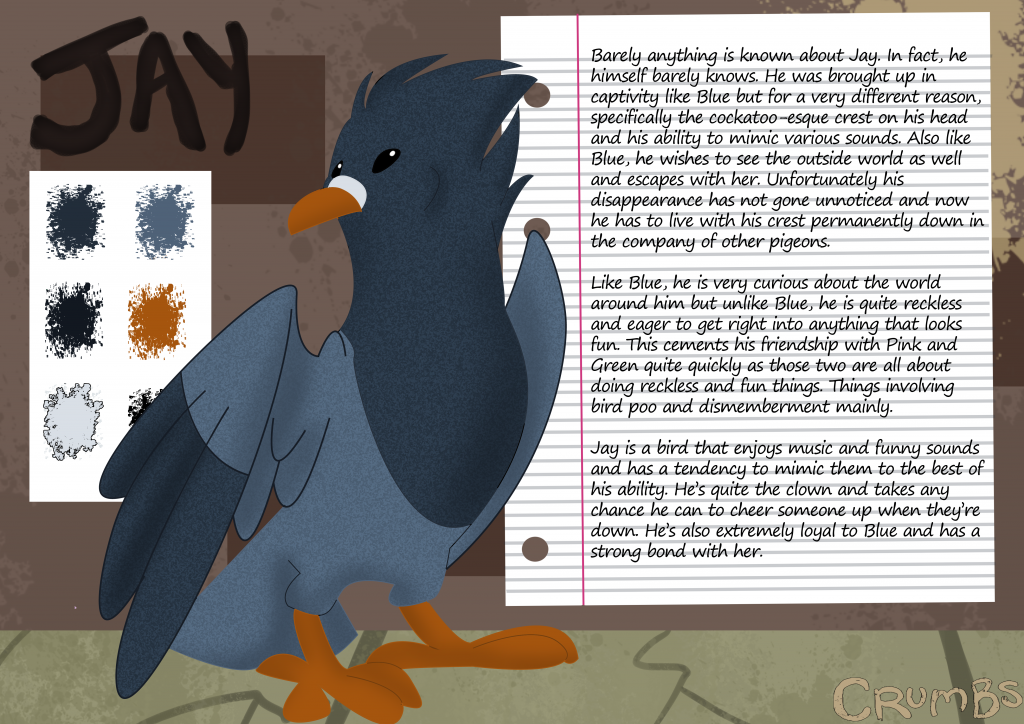
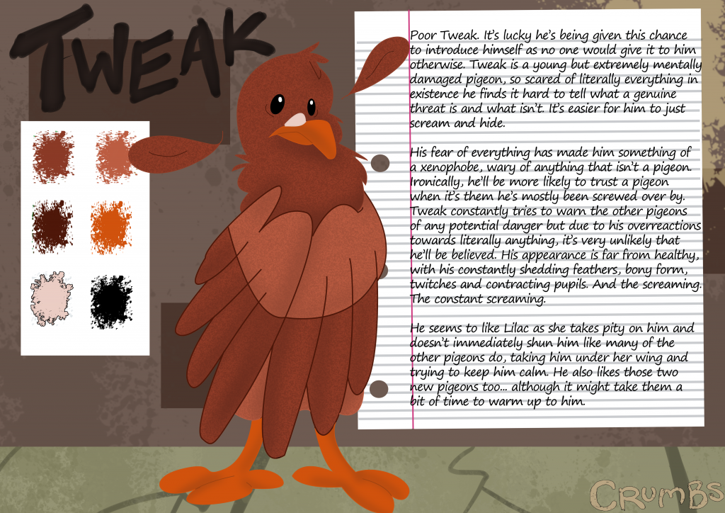
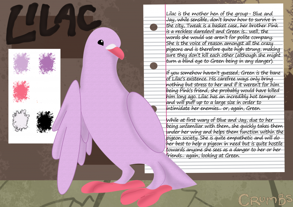
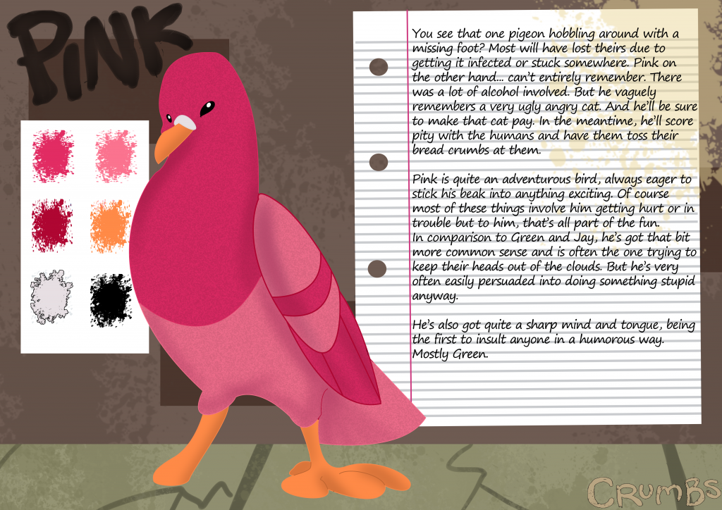
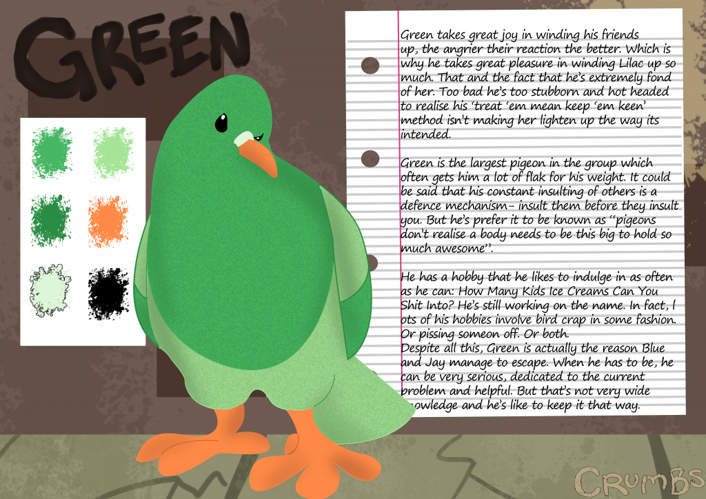
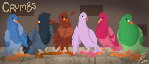
Anyway, let's get to the real meet of this entry: the character sheets.

They're finally done.

At least until I decide I hate them and change them again. Hopefully that won't happen but I'm not holding my breath.

Anyway, without further ado, here they are. It's great to now have a clearer idea of who these characters are and what their general overall personality is like. It's quite easy to forget when you don't have it written down somewhere. That, or I'm just a derp.

EDIT: Now without typos!


Sunday 4 November 2012

Crumbs Character Line Up


It only occurred to me recently that I hadn't drawn all of the main pigeons (or the 'breadwinners' as they'll be known... it'll make sense in context) together for some time now and definitely not with the new addition, Jay. So while doing sketches for their new character sheets, I figured I might as well do a lineup. I have to admit, I'm quite happy with how it came out, they don't look too shabby together!

I can definitely see the improvement from my previous work. Lets have a little comparison of the poster/lineup I did a few months ago, shall we?


Pretty different. The logo is it's own unique font and the pigeons look quite a bit better (at least in my opinion), with the shading making them come more to life and spring off of the page more. Also, Scarlet hasn't been written out, she will be showing up in the comic. She's just not a main character and I have a few ideas for her...

I'm also making more of an effort with my backgrounds as well. While the new lineart picture isn't really a good example of that, you'll definitely see improvement in work I will be uploading in the future. But as far as this goes, I wanted to give Crumbs something of a gritty dirty look, illustrated by the splatters of paint often on the ground. That isn't shown at all in the old lineup, apart from the horribly placed splat over the title. Meh.

While not terrible, I can safely say the new one is an improvement. Do you agree or not? Feel free to share your opinions and suggestions.

Saturday 3 November 2012

Ermahgerd Learfes

Some Crumbs concept art I would like to share with you.


I like autumn pictures. Best time of the year for all the red colours and whatnot!